GARMIN CONNECT
GARMIN CONNECT
2024
2024
Taking Garmin Connect to the next level with an enhanced onboarding experience, a fresh UI, social networking features, and more accessible health & fitness stats.
#apps #mobile #UI #UX
Summary:
Garmin Connect is an all-encompassing mobile app for tracking health and fitness, compatible with a range of Garmin devices.
Skills:
+ UX Research
+ UI Design
+ Visual Design
+ Prototyping
Tools:
+ Figma
+ Figjam
Date
Date
Jan 2024 - April 2024
Jan 2024 - April 2024
Starting point
Starting point
Interestingly, Garmin has listened to frustrated users, and started rolling out an app revamp in January 2024 to selected users as I was working on this case study.
Below are some screenshots of the new Garmin app, courtesy of triathlete blogger DC Rainmaker. The redesign focuses mostly on the Home page.

Research
Research
My work for this case study started by taking stock of the current state of the Garmin Connect app with a heuristic evaluation, as well as learning from its users, and comparing its feature set to that of competitors.
My work for this case study started by taking stock of the current state of the Garmin Connect app with a heuristic evaluation, learning from its users, and doing a competitive analysis.

Problems
Problems
1
Aesthetic appeal
Aesthetic appeal
A number of users have publicly questioned the app's outdated-looking UI (App Store reviews, Reddit, Garmin's forum, blog posts, etc.).
The exclusive use of Helvetica Neue and inconsistent semantic colors in graphs do not help in this sense. The reliance on so many colors can also worsen the experience of users with certain visual disabilities.
2
Feature set
Feature set
Users seem to want more powerful tools to articulate and shape fitness goals. Garmin has already made some attempts in this direction (Coach, Badges, Challenges).
The app could still improve its social features to compete with Strava, Nike, or Peloton.
3
Navigation & hierarchy
Navigation & hierarchy
Overall, the UX is unintuitive. It's not easy to navigate or find information within the app
For example, the "More" button in the menu hides several key features, custom options and information.
As a result, some users may be unaware of useful app features.
4
Data visualization
Data visualization
Advanced users love the amount of data in the app, but others may feel it's overwhelming. The app could offer different options to these different kinds of users.
The app offers a lot of data. However, default data viewing options lack visuals.
Technical terms used for metrics are also a significant barrier. There is a small "Help" option for in specific reports, but unaware users may have to visit Garmin's web to look up definitions.
1
Aesthetic appeal
A number of users have publicly questioned the app's outdated-looking UI (App Store reviews, Reddit, Garmin's forum, blog posts, etc.).
The exclusive use of Helvetica Neue and inconsistent semantic colors in graphs do not help in this sense. The reliance on so many colors can also worsen the experience of users with certain visual disabilities.
2
Feature set
Users seem to want more powerful tools to articulate and shape fitness goals. Garmin has already made some attempts in this direction (Coach, Badges, Challenges).
The app could still improve its social features to compete with Strava, Nike, or Peloton.
3
Navigation & hierarchy
Overall, the UX is unintuitive. It's not easy to navigate or find information within the app
For example, the "More" button in the menu hides several key features, custom options and information.
As a result, some users may be unaware of useful app features.
4
Data visualization
Advanced users love the amount of data in the app, but others may feel it's overwhelming. The app could offer different options to these different kinds of users.
The app offers a lot of data. However, default data viewing options lack visuals.
Technical terms used for metrics are also a significant barrier. There is a small "Help" option for in specific reports, but unaware users may have to visit Garmin's web to look up definitions.
Solutions
Solutions
Onboarding
Onboarding
+
+
UI & Branding
UI & Branding
+
+
Social features
Social features
+
+
Data viz
Data viz
Onboarding
+
UI & Branding
+
Social features
+
Data viz
To alleviate the problems outlined above, I focused on these four areas:
Improving the onboarding flow, to ensure that users learn about the app's main benefits and tools already at this stage.
Needed UI enhancements and a brand refresh for a more modern and unique feel.
Redesigning the app's social features and adding a new feature that opens up local discovery options: Clubs.
Enhancing the data experience and hierarchy, with a new language for graphs that puts visuals at the forefront and adding in-app definitions. Users data can now found under a core menu item in the bottom navigation bar: Activity.
To alleviate the problems outlined above, I focused on these four areas:
Needed UI enhancements and a brand refresh for a unique and modern feel.
Improving the onboarding flow, to ensure that users learn about the app's main benefits and tools already at this stage.
Redesigning the app's social features and adding a new feature that opens up local discovery options: Clubs.
Enhancing the data experience and hierarchy, with a new language for graphs that puts visuals at the forefront and adding in-app definitions. Users data can now found under a core menu item in the bottom navigation bar: Activity.
Final result
Final result
You can use the prototype below to preview how the new Garmin Connect app would look like after the redesign.
Click on the phone's screen to get started.
You can use the prototype below to preview how the new Garmin Connect app would look like.
You will need a Figma account and the Figma app installed to view this on your phone. If you don't have it, please visit the desktop version of my website!
Once you are in Figma, click on the phone's screen to get started.

You can interact with the prototype using motions similar to those on real smartphones, such as swiping.
Please note that this prototype is not a full-fledged app, as that would be beyond this case study's scope. You may find some unresponsive buttons, and not all paths are prototyped.
To simulate filling in user forms (i.e., during sign up), simply click on form fields.
Onboarding
Onboarding
This revised onboarding flow ensures that users can learn about app benefits and features as soon as they enter the app.
Another important angle is asking users about their favorite sport activities and expectations for using the app.
These data could be used to inform app customization for different user groups in the future (i.e., more data-heavy, more focused on health aspects than fitness, etc.).

Social features
Social features
Currently, Garmin Connect lags behind competitors that offer social networking features.
Users can send friend requests, but this is hidden under "More".
Challenges are generic and do not seem to be recommended or tailored to users, which may hamper adoption.
I propose introducing a new feature, "Clubs", to improve and group together social functions in the app.
As an entity, "clubs" are profiles of communities who train together.
Club recommendations and location-based searches will bring discovery into the app, helping users find new avenues to carry out their training.
The friend request button is also now easier to find on the upper-right corner.
During onboarding, users can now set up a username and profile picture, helping friends recognize each other. They also specify training preferences and app goals, which can be used to customize challenge suggestions.

I propose introducing a new feature, "Clubs", to improve and group together social functions in the app.
As an entity, "clubs" are profiles of communities who train together (i.e., a sports team, a running club, etc.).
Club recommendations and location-based searches will bring discovery into the app, helping users find new avenues to carry out their training.
The friend request button is also now easier to find on the upper-right corner of "Clubs".
During onboarding, users can set up a username and profile picture, helping friends recognize each other.
Information now collected during onboarding could be also used to recommend more precise challenges, making Garmin challenges less generic as a result, and possibly improving user adoption.

Branding
Branding
A new app icon to actualize Garmin Connect. You can check the real app icon here on the App Store.
A new app icon to actualize Garmin Connect. You can check the real app icon here on the App Store.


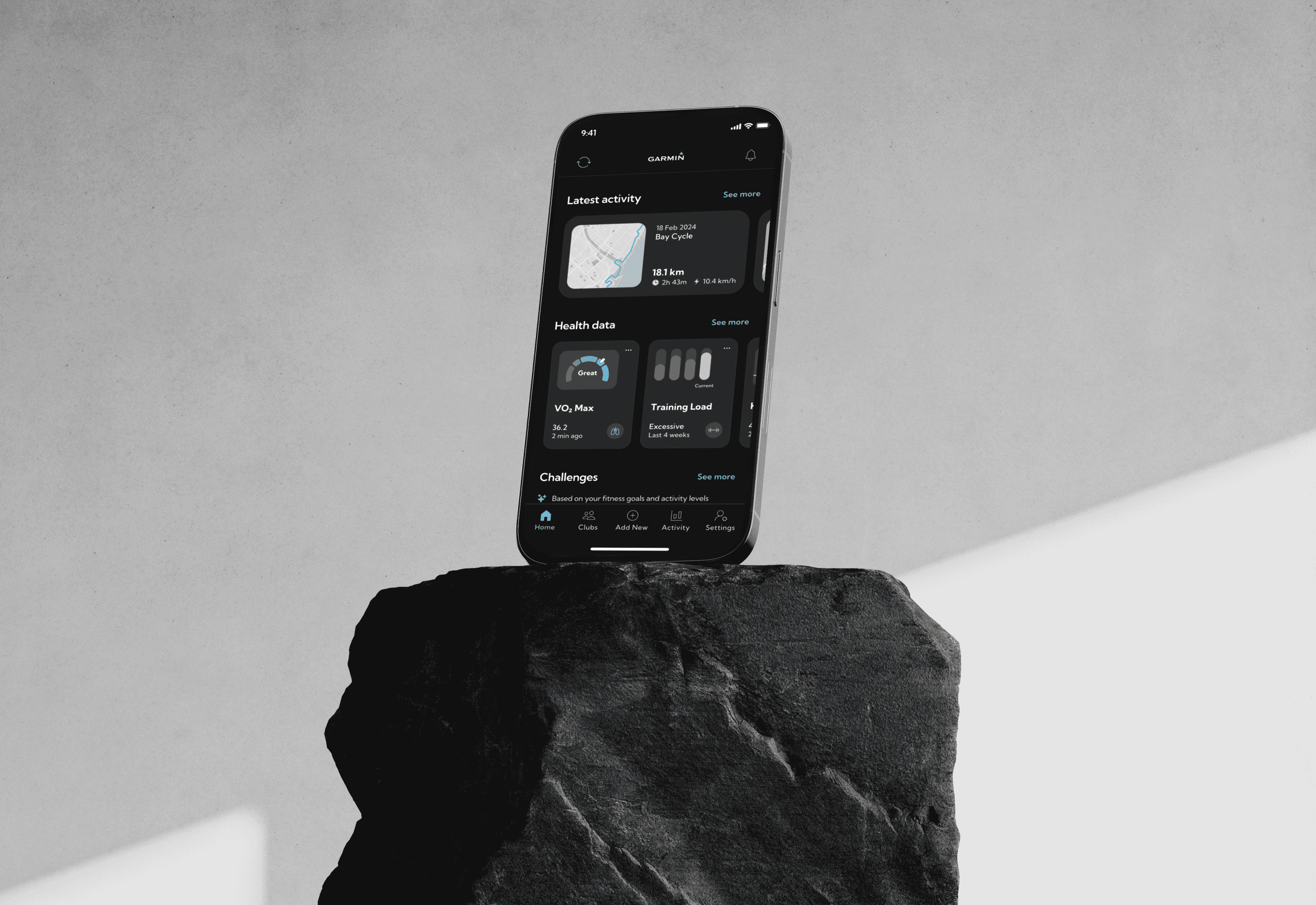
Data visualization
Data visualization
Making data more visual and easy to access with data cards in wide and small versions, used in Activity and Home respectively.
Adding definitions for all data points within the app to contextualize graphs.
Streamlining the color palette of the app, and using graphs that leverage opacity instead of hue differences to convey meaning.

In the future, I would also offer users the option to re-introduce some of the sections that used to be on the homepage previous to Garmin's last revamp in 2024. These were quick-view summaries (Last 7 days, At a glance…) with data lists that were particularly relevant for advanced users.
In the future, I would also offer users the option to re-introduce some of the sections that used to be on the homepage previous to Garmin's last revamp in 2024. These were quick-view summaries (Last 7 days, At a glance…) with data lists that were particularly relevant for advanced users.

More case studies
About me
My background blends hands-on execution across B2B and B2C solutions with product design strategy, including deep expertise with design systems and accessibility.
Currently, I’m focused on shaping digital experiences for one of Spain’s top insurance companies at Garaje de Ideas.
Contact
About me
My background blends hands-on execution across B2B and B2C solutions with product design strategy, including deep expertise with design systems and accessibility.
Currently, I’m focused on shaping digital experiences for one of Spain’s top insurance companies at Garaje de Ideas.
Contact
About me
My background blends hands-on execution across B2B and B2C solutions with product design strategy, including deep expertise with design systems and accessibility.
Currently, I’m focused on shaping digital experiences for one of Spain’s top insurance companies at Garaje de Ideas.
Contact
About me
My background blends hands-on execution across B2B and B2C solutions with product design strategy, including deep expertise with design systems and accessibility.
Currently, I’m focused on shaping digital experiences for one of Spain’s top insurance companies at Garaje de Ideas.