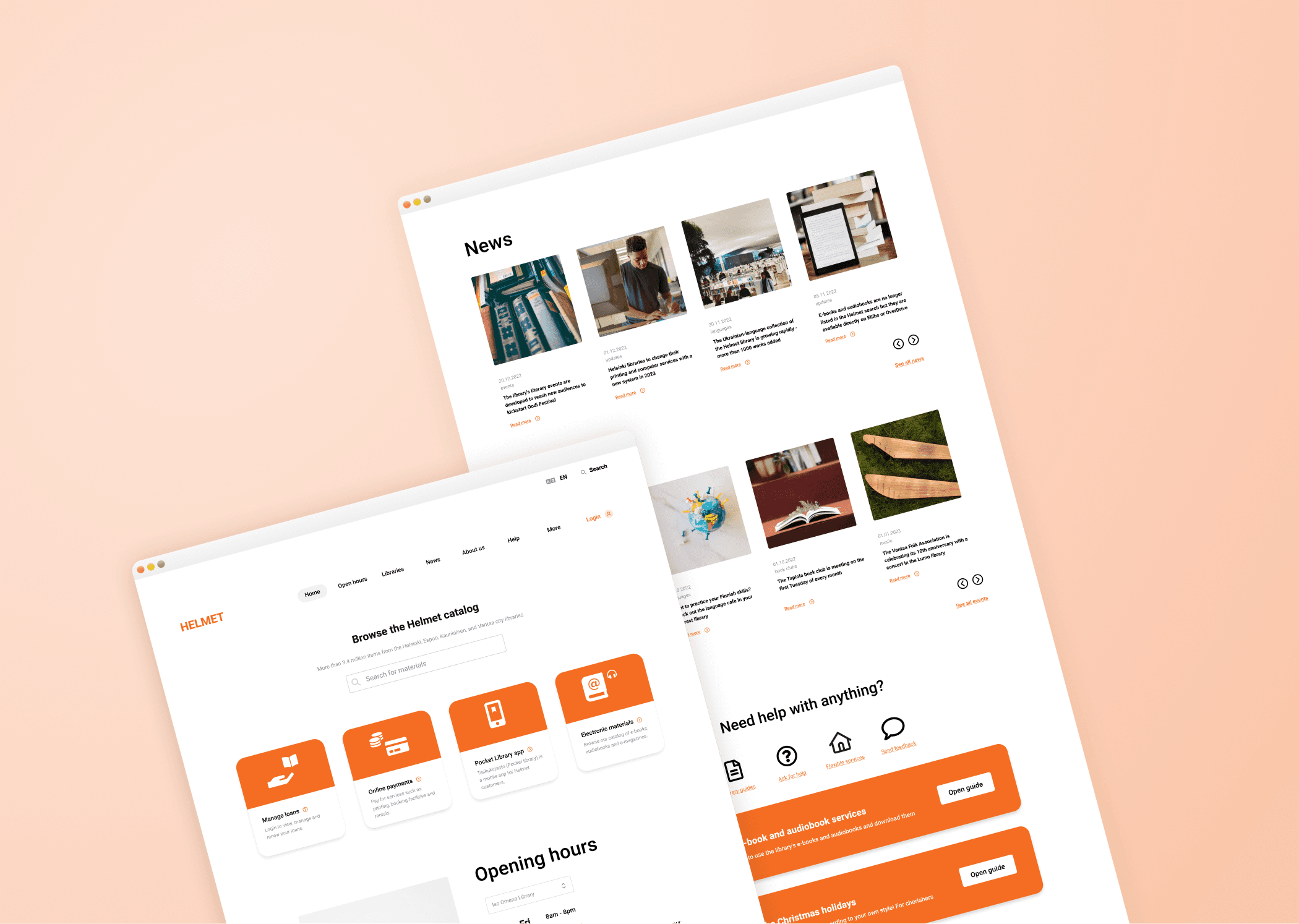
Streamlining the Helmet.fi homepage. More breathing room, clearly defined content blocks, and a minimal, yet friendly feel.
Summary:
Helmet.fi receives around 17 million visitors every year. It's the largest public electronic library in the Nordics.
Skills:
+ UI Design
+ User Experience
+ Content Design
+ User Research
Tools:
+ Figma

Introduction
This case study is largely based on my own experience using Helmet services. I was also able to ask several personal contacts for user feedback, given how the site is so widely used.
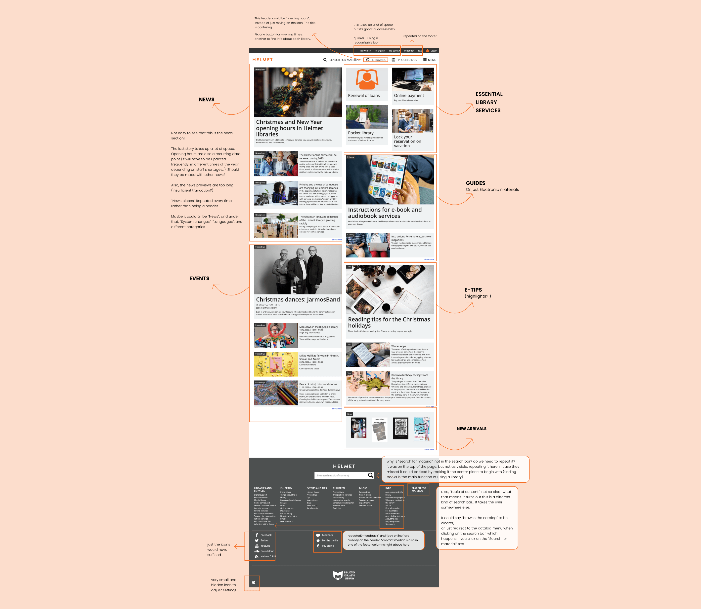
Starting point
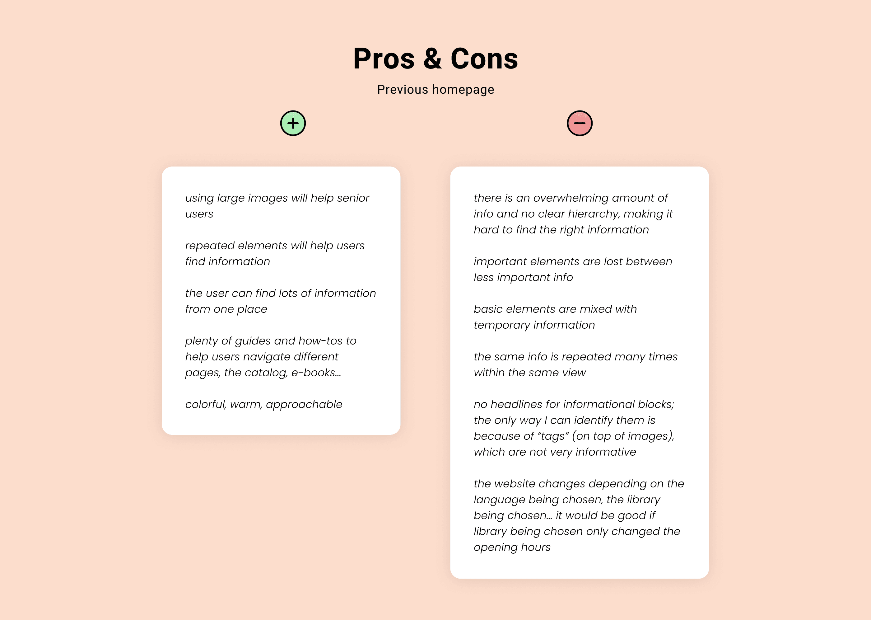
The starting point was an information-dense website where it was difficult to locate the library's basic services, and the correct information and resources. Many elements were repeated constantly, probably so that users wouldn't miss them.
Scope of work
Continuity was particularly important in this project. Since the library is used by all kinds of people, the new homepage needed to remain somewhat recognizable for accessibility purposes.
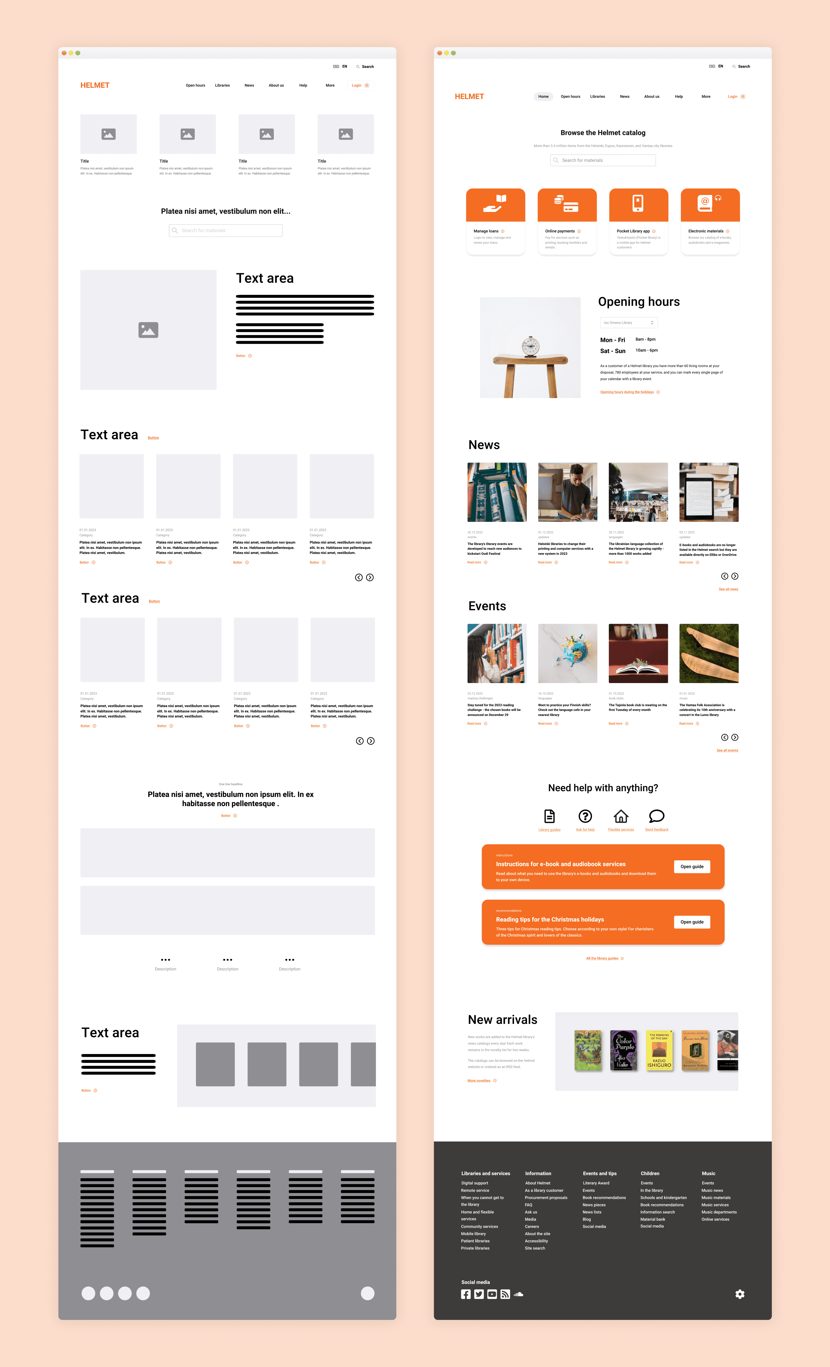
I decided to introduce a lot more breathing room, clearly defined sections, and a better-organized footer section.
Final Design
Here is a side-by-side comparison of the initial lofi wireframe and the final product:
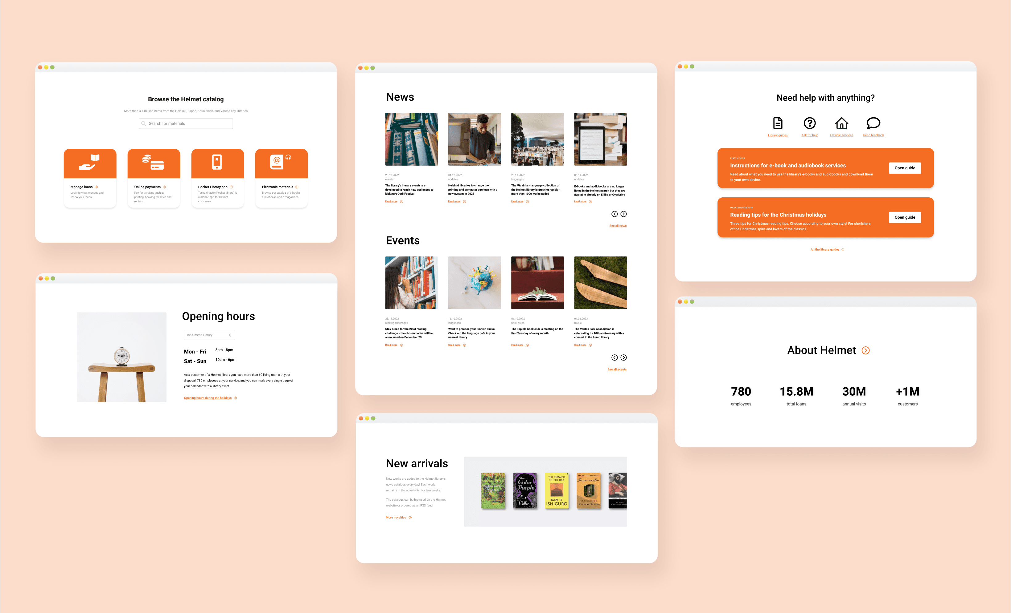
Detail shots
This design features more explicit homepage sections: Browse, Opening hours, News, Events, Help Guides, New Arrivals, and About Helmet.

More case studies